
Decoratoradvice com: A No-Nonsense Guide to Decorating on a Real Budget
Most decorating advice online assumes you have unlimited time, a blank room, and a flexible budget. Real homes rarely work that way. You’re decorating around a lease that ends in March, a couch you inherited from a roommate, or a paint color the last owner picked that you haven’t gotten around to changing. That’s the gap decoratoradvice com tries to fill: not aspirational showroom photos, but decorating principles that actually hold up in a rental, a starter home, or a living room you’ve been meaning to fix since last year. This piece pulls together four of the most reliable, designer-backed rules for stretching a small decorating budget, walks through where each one works best, and points to where you can dig deeper if a particular room is giving you trouble.
What’s Actually on our blog
The short version: room-by-room guides, color and layout rules explained without jargon, and budget-first furniture advice. If you want the longer story of why the site exists and who writes for it, the about page covers that. The four rules below are the ones we point people to most often, because they apply almost everywhere and cost nothing to test.
Rule 1: The 60-30-10 Color Split
Pick three colors for a room: one dominant, one secondary, one accent. The dominant color covers roughly 60% of the visible space, usually walls and large furniture. The secondary color takes about 30%, typically rugs, curtains, or an accent chair. The remaining 10% is reserved for small, high-impact touches: pillows, art, a single statement object. The math doesn’t need to be exact, but the proportions keep a room from feeling washed out from too much of one color or chaotic from too many competing ones.
| Layer | Share of room | Where it usually goes |
| Dominant | ~60% | Walls, large furniture, flooring |
| Secondary | ~30% | Rugs, curtains, accent chairs |
| Accent | ~10% | Pillows, art, small objects |
Rule 2: Group Decor in Odd Numbers

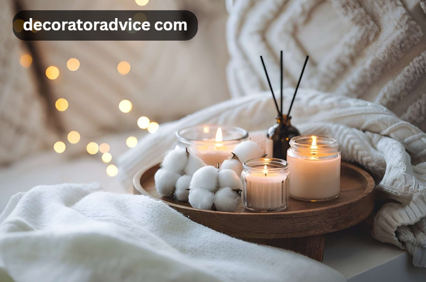
Symmetry feels safe, but it also makes the eye stop moving. Three candles at different heights pull attention back and forth in a way that four matching ones don’t. This is the 3-5-7 rule: arrange vases, books, or framed art in groups of three, five, or seven rather than even pairs. It works on a mantel, a bookshelf, or a coffee table, and it costs nothing if you’re just rearranging things you already own. The trick that makes it look intentional rather than random is varying the height of each piece, so the grouping forms a rough triangle instead of a flat line.
Rule 3: Fewer, Bigger Pieces Beat More, Smaller Ones
A room with one large piece of art and one substantial vase usually looks more put-together than the same room with a dozen small trinkets spread across every surface. Oversized decor reads as a deliberate choice. A scatter of small items reads as clutter, even when each individual piece is nice on its own. On a tight budget, this is good news: one statement piece is often a better use of money than ten small ones, and it leaves you with fewer decisions to second-guess later.
Rule 4: Paint Top to Bottom
If a room needs paint, the order matters more than people expect. Start with the ceiling, move to the walls, and finish with trim, window frames, and baseboards last. This sequence means any drips or splatters land on a surface you haven’t finished yet, instead of ruining something you just painted. It’s a small detail, but skipping it is one of the more common reasons a DIY paint job ends up looking patchy around the edges.
| Step | Surface | Why it goes in this order |
| 1 | Ceiling | Drips fall onto unfinished surfaces below |
| 2 | Walls | Painted after the ceiling is dry and taped off |
| 3 | Trim, windows, baseboards | Done last so dust or splatter doesn’t land on fresh paint |
How These Rules Work Together
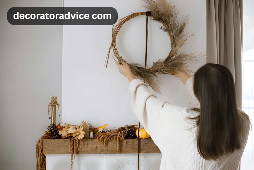
None of these need to be used in isolation. A room painted top to bottom in a 60-30-10 palette, with decor grouped in odd numbers and a couple of oversized statement pieces instead of a dozen small ones, tends to look considered rather than accidental, regardless of the budget behind it. For room-specific applications, the decoration tips decoradhouse hub breaks these down by space, and if you’ve got a balcony or small yard to work with, decoradhouse garden tips applies the same budget-first thinking outdoors.
Frequently Asked Questions
What is our platform?
Our platform is a home decorating resource focused on practical, budget-conscious advice for real rooms rather than designer showrooms, covering color, layout, furniture, and small-space styling.
What is the 60-30-10 rule in decorating?
It’s a color-proportion guideline: 60% of a room in a dominant color, 30% in a secondary color, and 10% in an accent color, used to keep a palette balanced and intentional.
Why do designers group decor in odd numbers?
Odd-numbered groupings, typically three, five, or seven items, create visual movement because the eye can’t settle on a symmetrical midpoint the way it does with pairs.
Final words
None of these four rules require buying anything new to test. Rearranging what you already own according to the 3-5-7 rule, or checking whether your current color scheme is close to 60-30-10, takes an afternoon and tells you a lot about what’s actually not working in a room. Honestly, the paint-order rule is the one most people skip first, and it’s the one that causes the most touch-up work later.